I needed a circular range control to be for a project using Unity UI, and there seemed not to be one built-in, I created one. I wanted it to work on both desktop and mobile (touch). In building it I found out that to make it usable it requires quite a bit of tuning.
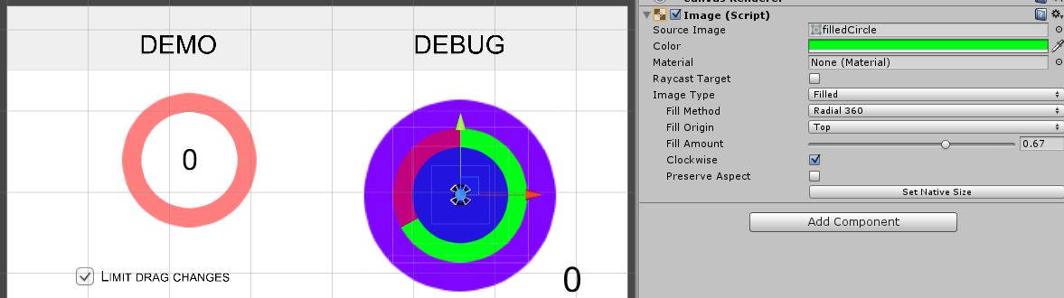
By circular range control I mean this:
which of course should be used in a decent graphical layout, not with my horrible sample colours and layout.
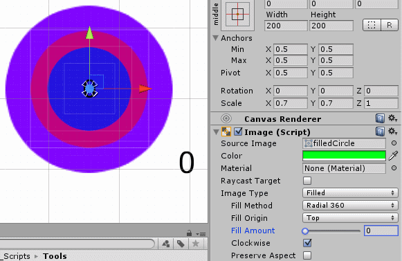
I create the control using three Image objects with the same circular sprite, the Image fill attribute and a little coding using UI event triggers – here is the code source. Then I had to fine tune how it reacts to drag and touch / click as to make it user friendly it has to behave asymmetrically. You find this to be dealt with in the code I provided.
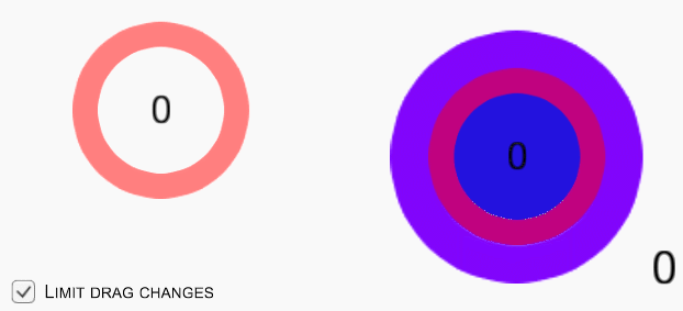
Circular Range Control Web Demo
Here is a WebGL demo you can play with:
The component supports both drag & (click || touch) and two modalities: react to any action or limiting reactions to drag to “intuitive” changes so depending on distance from origin (I did tests it with some users and there is a sort of intuitive behaviour which is non linear).
Try it mobile with an Android APK here.
Use it
To use it in you project, get the source below and attach it to a parent UI object and drag on the public UI properties the corresponding UI images and texts in your scene (you can of course use simple UI Text if you don’t have TextMeshPro). Care in particular that the image selected must be of type “Filled”:
Get the complete source file here.
Here is an instructional video on how to set it up:
Thanks as usual to Daniele Giardini for guru hints, Matteo Bicocchi for a fix and all those who tested it.
Following user’s requests, here is a link to get a sample project.
Follow me on Twitter where I post about game design, game development, Unity3d 2D, HTML5, applied / serious games.


Speak Your Mind